Typography
Digital products are built around text, so handling typography properly is crucial. We define fonts and sizes as reference tokens and system tokens grouped by their roles in the UI.
Last updated 11/1/2024
Fonts
The Serendie brand uses Roboto for Latin script and Noto Sans JP for Japanese. Serendie Design System follows suit and additionally provides the monospaced Noto Sans Mono. All of these fonts are open source and free for commercial use.
Use in CSS
In web applications, use these fonts as web fonts via providers such as Google Fonts. Serendie UI bundles them, so no additional setup is required.
If you configure them yourself, write the CSS font-family as shown below and set appropriate fallbacks to system fonts.
body {
  font-family: Roboto, "Noto Sans JP", -apple-system, BlinkMacSystemFont, sans-serif;
}
Use in Figma
All fonts are available in Figma by default. Note that Figma does not support automatic mixed typography for Japanese and Latin. For now, Serendie Design System recommends always setting Roboto in Figma.
Roboto is a Latin font and does not support Japanese, but Figma font fallback automatically applies Noto Sans where Roboto lacks glyphs. This enables mixed Roboto/Noto Sans without special plugins. While it lacks fine-grained control, we prioritize operational simplicity.
Font size
Font size (font-size) greatly affects readability and legibility. It is also important to keep sizes consistent by role, such as headings and body text, and to create rhythm by varying sizes.
Serendie Design System designs its type scale based on a harmonic series and defines it as reference tokens. To make the scale practical, we set 16px (medium) as the base, keep smaller intervals for frequently used sizes below medium (10px–14px), and use larger intervals above medium (18px–64px), where stronger jumps are needed.
References
Music, mathematics, typography - ÉKRITS
Weight
Change font weight when you need visual or semantic emphasis, such as for headings or highlights within text. We define two reference tokens: regular and bold. The numeric values are 400 for regular and 700 for bold.
Line height
Line height affects readability and overall feel. We define four reference tokens: normal (160%) as the base, relaxed (180%) for a more airy feel, tight (140%) for denser information, and none (100%) intended for labels such as buttons.
Notes for use in Figma
Like other tokens, these are defined as Variables, but as of November 2024, Figma does not allow setting Variables containing relative values for line height. Expecting future support, we currently operate with literal values instead of Variables.
Roles
Typography groups font, weight, size, and line height so each group serves a role in the UI, such as headline, title, body, or label. These are defined as system tokens.
Display
Uses the largest font sizes and creates a strong visual impression. It is used on large viewports such as PC screens when expression matters. The Display role has two sizes: small and medium.
Headline
Used as large headlines that concisely express the page or text. This role is frequently used regardless of viewport width. The Headline role has three sizes: small/medium/large.
Title
Used as subheadings smaller than Headline. Titles are often paired with Headline or Body, so we default them to a heavier weight to create contrast. There are four sizes: extraSmall/small/medium/large.
Body
Used for multi-line body text. There are four sizes: extraSmall/small/medium/large, with medium serving as the base text size across the site. Only the extraSmall size assumes multi-line supplemental text and uses a tighter line height.
Label
Used for text inside components like Buttons or for form labels. Label has four sizes: small/medium/large/extraLarge. All have a 100% (none) line height and assume a single line. If text wraps or contains line breaks, use Body instead.
Notes for use in Figma
Figma Variables do not currently support grouped tokens (called Composite Tokens). Therefore, typography system tokens are defined as Text Styles, not Variables, so be aware the application method differs from other tokens.
Changing the base size by browser width
The medium size of the Body role is intended for page copy and serves as the base font size.
However, it is common for this base size to change with browser width. In Serendie Design System, the base is 16px for Compact (mobile) widths and 14px for Expanded (PC) widths. The sizes of all roles change relative to this base.
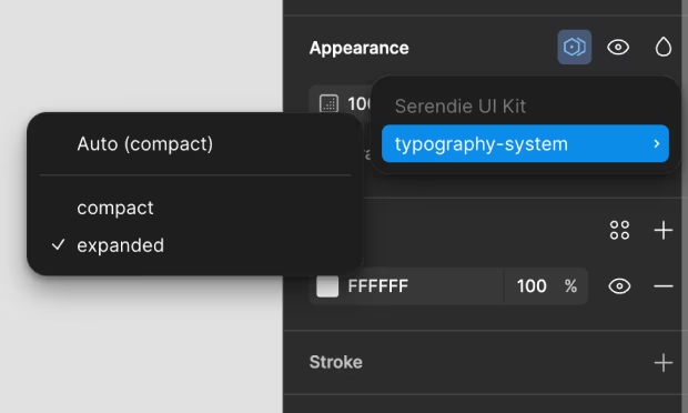
Serendie Design System treats this as a Variable mode. Similar to theming, assign a mode (Expanded/Compact) to pages, sections, or frames to change the base size.
The default is Compact mode (mobile). When designing for Expanded (PC), switch the whole page to Expanded mode.
