Dimension
Design tokens for dimensions: spacing, border width, corner radius, and breakpoints for responsive design.
Last updated 11/1/2024
Spacing
We define a sequence based on a harmonic series as reference tokens and provide 13 system-token sizes from twoExtraSmall to sixExtraLarge.
Frequently used small-to-medium sizes are defined in fine steps using multiples of four, while medium-to-large sizes are designed with larger jumps. When laying out in Figma, avoid absolute positioning and use Auto Layout as much as possible to leverage spacing tokens.
References
Music, mathematics, typography - ÉKRITS
Border width
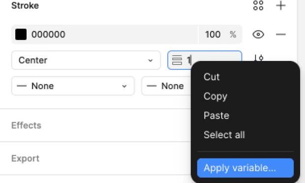
We define three system tokens for border width: medium/thick/extraThick. medium (1px) is the most common. In Figma, you can apply tokens by right-clicking the border width field in the Stroke pane.

Corner radius
When rounding corners, we define five levels from extraSmall to extraLarge. We define full as 9999 as an exception for capsule shapes.
Breakpoint
Tokens that represent breakpoints when changing styles by viewport width (responsive design). You do not need to consider them when using Serendie UI components in implementation.
Serendie Design System assumes mobile-first implementation, so breakpoints are defined as the lower bound of viewport width (min-width). We define four commonly used reference tokens from small to extraLarge.
For now, since we provide components for compact and expanded widths, we define 768px as the system token for switching to expanded designs. If we later add system tokens for tablets or wide desktops, adjust the references accordingly.