Design
How to use the Serendie UI Kit during UI design work.
Last updated 11/1/2024
What is the Serendie UI Kit
Serendie UI Kit is part of the Serendie Design System and is a set of design assets available as a Figma library. It is published on Figma Community and anyone can use it, not just Mitsubishi Electric team members.
Currently, it includes the following assets:
- Design tokens — definitions such as color and typography provided as Figma Variables
- UI components (Serendie UI) — Figma components for common UI such as Buttons and Text Fields
- Icons (Serendie Symbols) — a collection of 300+ icons that express the Serendie personality
- Samples — example screen designs created with items 1–3; you can also start your design work from these samples
This page covers the basics of using the Serendie UI Kit. For details on each area, see Foundations and Components. We also run bootcamps for Mitsubishi Electric members; check the internal portal for upcoming sessions.
Learn the fundamentals of Figma
The Serendie UI Kit is built for Figma. Figma is rapidly becoming the industry-standard tool for digital product UI design, enabling structural design with components rather than crafting each screen as a flat image.
Components, variants, Auto Layout, and Variables are key Figma features, and the Serendie UI Kit is designed with them in mind. Start by learning the basics with Figma’s help articles.
Guide to Figma components - Figma LearnCreating and using variants – Figma LearnInspect Auto Layout properties - Figma LearnGuide to variables in Figma - Figma Learn
Use the Serendie UI Kit
Add the library to your Figma file
Within Mitsubishi Electric’s Figma organization, the Serendie UI Kit is available as a library. From any Figma file where you want to use it, search for the library and add it. For external users, the latest Serendie UI Kit is published on Figma Community—use that version.
Serendie UI Kit - Figma Community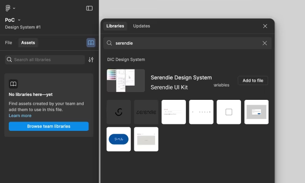
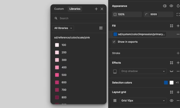
Use design tokens
After adding the Serendie UI Kit as a library, you can use definitions for color, typography, spacing, and more within your Figma file. For details about design tokens, see Foundations.
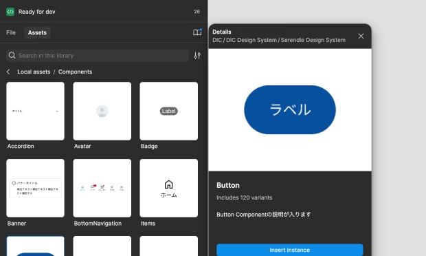
Use UI components
The UI components that the Serendie UI Kit provides (Serendie UI) are available from the Assets panel in Figma. When adding components, choose the appropriate variant. For explanations of components and their variants, see Components.
Use icons
The icon set provided by the Serendie UI Kit (Serendie Symbols) is also available as components in Figma via the Assets panel. For details, see Foundations.
![]()
Use samples
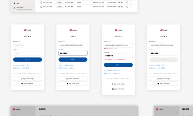
We provide common sample screens—such as login and walkthrough screens—built with the design assets in the Serendie UI Kit. You can start your design work from these samples. See the Examples page inside the Serendie UI Kit.
Switch modes
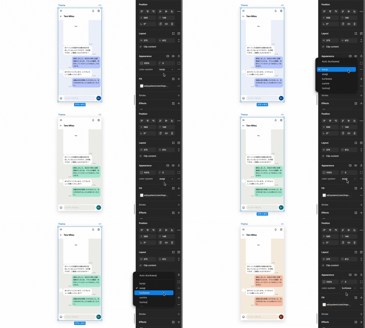
Figma Variables support variable modes, which are a powerful way to express context-driven UI changes—such as dark mode or responsive design—inside design files.
The Serendie UI Kit currently uses variable modes to support switching between multi-color themes and switching typography according to device width. Switch modes by applying a variable mode to layers in Figma.
For more information, see Theming and Typography.
