Development
How to implement screen designs based on the Serendie UI Kit in React for web front-end development.
Last updated 4/2/2025
Serendie UI
We provide an implementation of the design tokens and UI components from the Serendie UI Kit so they can also be used in web front-end development. The set of UI components you mainly use during development is called Serendie UI.
Serendie UI currently targets React environments. It is published as OSS and is available to anyone—inside or outside Mitsubishi Electric.
This page covers the basics for getting started with Serendie UI. We also host bootcamps for Mitsubishi Electric members; check the schedule on the internal portal.
Serendie UI - GitHub
Review the designs
Figma - Dev Mode
Within Mitsubishi Electric’s Figma organization, we provide Dev Mode accounts for developers. Dev Mode is a developer-focused Figma view that offers inspectors and annotations useful during implementation. See the Figma help page for details.
Dev Mode guide - Figma LearnFigma - Code Connect
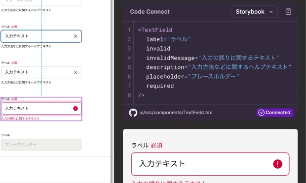
Serendie UI components support Code Connect. Code Connect shows code snippets corresponding to components in the design file directly in Figma Dev Mode. By using Code Connect, you can review the design while simultaneously viewing implementation examples with Serendie UI.

Storybook
We also provide the same content as Storybook. Use it when you want to dig deeper into state changes for each component or see how they map to React component props.
Preparation
Join the GitHub team
Serendie UI is OSS and open to all, but for Mitsubishi Electric members we provide a place to ask questions and make requests via GitHub Discussions. If you are a Mitsubishi Electric member, contact the Serendie Design System team to request an invitation to the GitHub team.
Use Serendie UI
Serendie UI supports React environments. To use the React components, install as follows:
npm install @serendie/uiThen apply the Serendie UI CSS in your project’s root CSS file:
@layer reset, base, tokens, recipes, utilities;
@import "@serendie/ui/styles.css";
From there, import the UI components you need and implement your product. For details and sample code for each UI component, see Components.
import { Button } from "@serendie/ui";Learn the APIs
Serendie UI internally uses Ark UI as its headless UI library, and each component’s API follows Ark UI. For components with complex interactions—such as Select—consult the Ark UI API reference as well.
API Reference - Ark UIExtend functionality and override styles
Serendie UI uses Panda CSS as its styling library. You can use Panda CSS utilities to extend components, change themes, or override styles. For details, see Serendie UI’s README.
Introducing Panda CSS to your project is optional. If you do not need to extend functionality or override styles, or if you prefer another styling library, you can skip it.
Get started with Panda - Panda CSS
Use design tokens
Serendie UI and the design tokens are distributed as separate packages, and it is possible to use only the design tokens.
The design tokens are distributed in a form that is broadly usable in CSS/JavaScript environments. They are helpful in scenarios where “Serendie UI isn’t an option, but we want to use the color and typography definitions,” such as when the project is not based on React.
Install via a package manager such as npm:
npm install @serendie/design-tokenYou can view the list of design tokens here.