Design Tokens
Design tokens are the smallest building blocks of the design system. Sharing them between design and development enables a Single Source of Truth.
Last updated 11/1/2024
What are design tokens
Design tokens are key/value pairs that represent visual elements of digital products, such as color, typography, dimension, and elevation. They are the most abstract building blocks in a design system and shape every UI component.
Design tokens serve as a common language connecting design and development. For example, instead of specifying a button’s background color as “#0A69CF,” you specify the token “color.impression.primaryContainer,” which conveys the intent of “the key brand color background.” Communicating design intent in richer detail enables smoother product development.
Use cases and benefits
Beyond streamlining communication, using design tokens also guarantees a baseline of design quality and lets teams focus on product development.
The values represented by design tokens capture know-how, such as accessible colors with sufficient contrast ratios, typefaces appropriate for the brand and platform, and legible type scales. By using design tokens, teams can start development based on this expertise—even without a dedicated designer.
Serendie Design System’s UI component set (Serendie UI) is built on design tokens, so you don’t need to think about design tokens when you use Serendie UI as-is. When you override Serendie UI styles or add custom components, understanding the role and structure of design tokens becomes important.
You can also use only the design tokens without Serendie UI. If project constraints prevent you from using Serendie UI, consider using just the tokens.
Naming structure
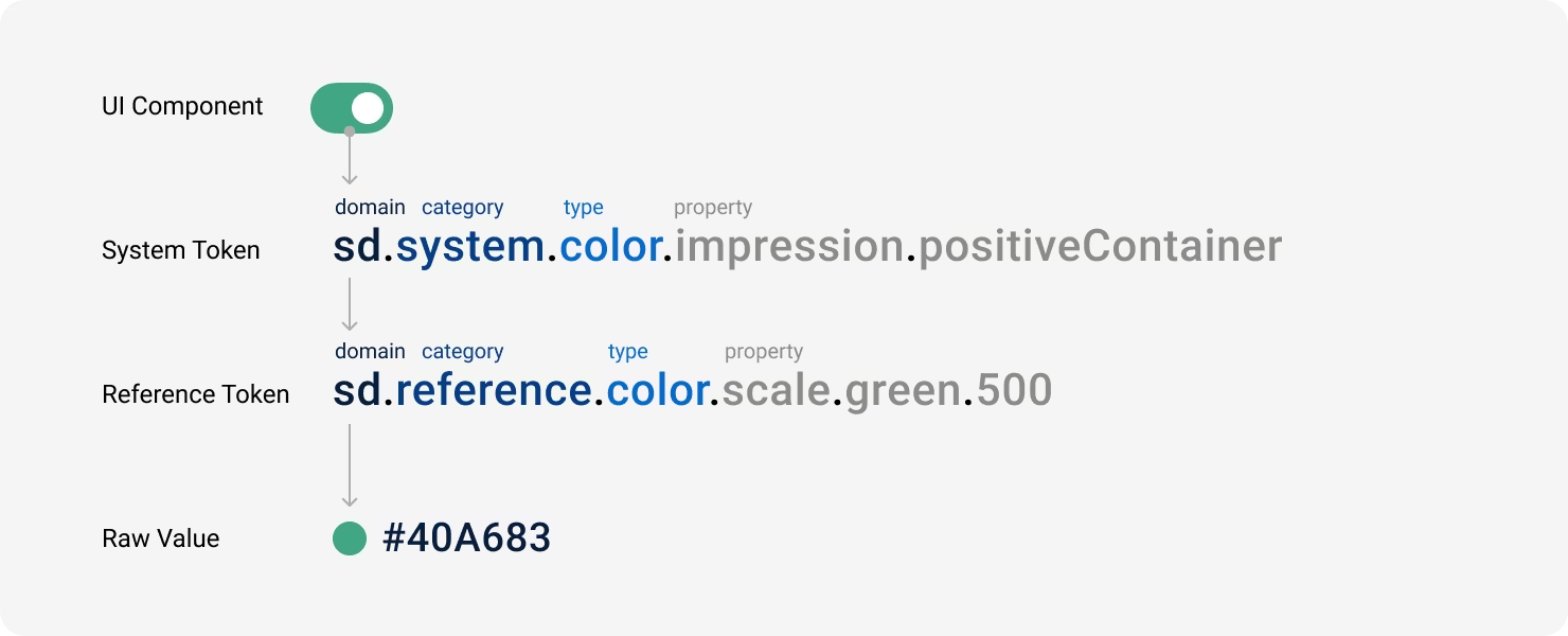
Serendie Design System’s design tokens consist of two types: “reference tokens” and “system tokens.” Reference tokens store raw values such as color codes, while system tokens reference (alias) those reference tokens.
Reference token names are straightforward—such as color.scale.green.500 (the 500 swatch in the green color scale)—whereas system tokens are named with stronger semantic meaning in the UI—such as color.impression.positiveContainer (a background color that conveys a positive impression).
The naming structure also adds prefixes for domain (brand abbreviation), category (system, reference), and type (color, typography, etc.) to form a single token name. This structure is intended to support multiple Mitsubishi Electric brands.
References
Design tokens - Material Design 3Design tokens - SpectrumHow to create design tokens - putchom
Format
As a shared language, design tokens must be easy to consume from Figma, web front-end environments, and beyond. When managing design tokens, we first define them in a platform-agnostic format and then set up a build pipeline to convert them for each platform.
Serendie Design System adopts the draft format currently being defined by the W3C Community Group’s Design Tokens Format Module. This format expresses design tokens in JSON and specifies metadata such as the token type ($type).
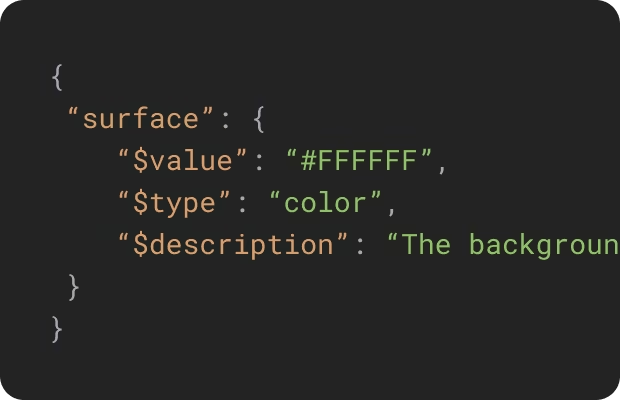
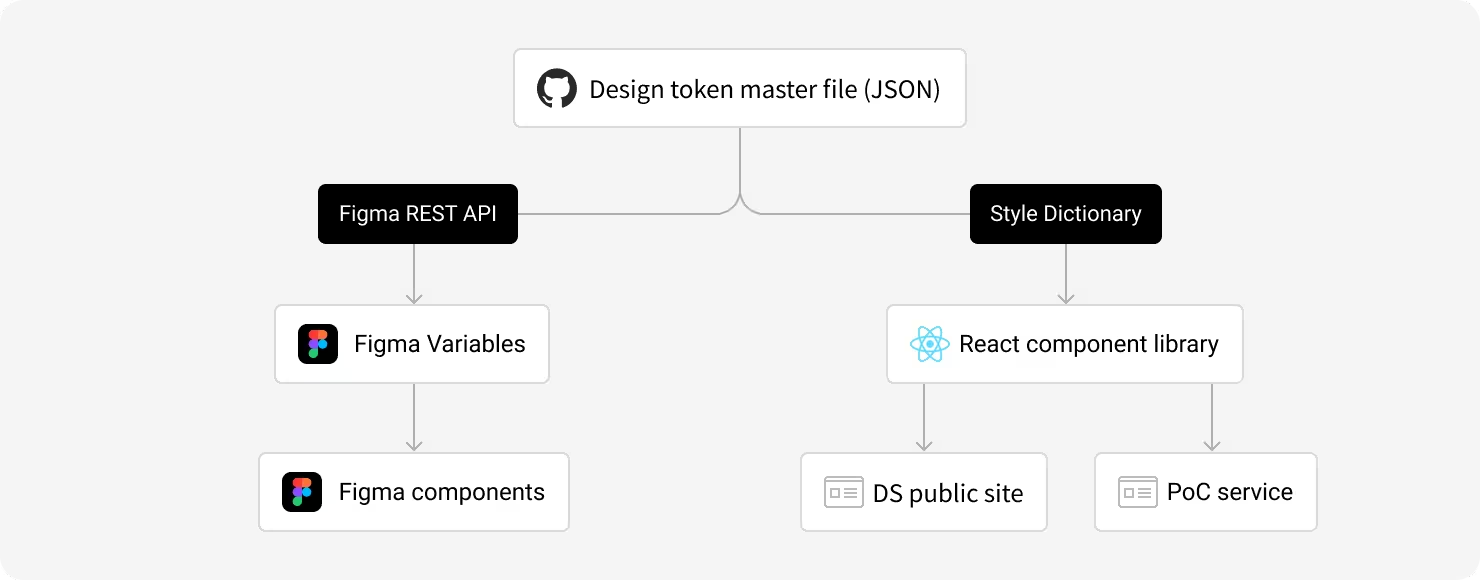
These JSON files are managed in the Serendie Design System GitHub repository and serve as the master Single Source of Truth. On top of that, we use Style Dictionary in our build pipeline to convert the JSON into outputs suited for each environment (CSS, TypeScript, etc.).
References
Design Tokens Format Module – W3C Community Group Draft Report
Handling context changes
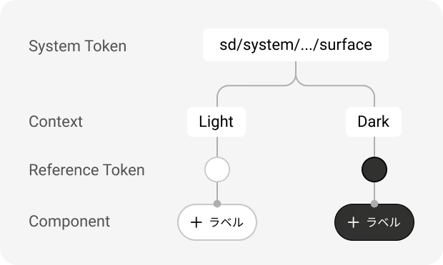
Design tokens change based on context—responsive design adapts the UI to device and browser sizes, and dark mode changes colors based on the environment. To handle these changes, Serendie Design System’s design tokens use a two-layer structure where system tokens reference reference tokens.
When the context changes, you update which reference tokens the system tokens point to, enabling UI changes without touching the product code. Referencing reference tokens directly within the UI would make it impossible to respond to context changes, so always reference system tokens by default.
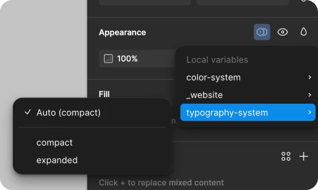
As of November 2024, the Design Token Format Module draft does not yet define a format for expressing context. Serendie Design System handles this by splitting JSON files per context—such as “typography.compact.json” and “typography.expanded.json.” In Figma, these become Variable modes. See Get Started for more about variable modes.
Sync between code and Figma (for Mitsubishi Electric)
To realize a Single Source of Truth between code and design, Serendie Design System automatically syncs design tokens managed in the master files to the design side as Figma Variables.
Figma users can therefore design with the tokens managed in the master files by using Variables. This sync uses the Figma REST API and, as of November 2024, requires a Figma Enterprise plan.
With this setup, a change to the primary color, for example, automatically propagates to both design files and web applications, making design tokens a true common language for development and design.
Naming rules
Naming matters for design tokens as well. Serendie Design System draws heavily from Material Design 3, including its naming guideline for tokens.
We follow these rules. The guiding principles are avoiding dependency on specific technologies or platforms and avoiding shorthand so that tools can offer autocomplete.
- Use lower camelCase
- Avoid starting with Arabic numerals; use words instead (use twoExtraSmall, not 2extraSmall)
- When using t-shirt sizes, avoid abbreviations like xs; use extraSmall
- Focus on screen width (Expanded/Compact) rather than device type (PC/Mobile)
- Choose terms that are platform-agnostic