Illustration
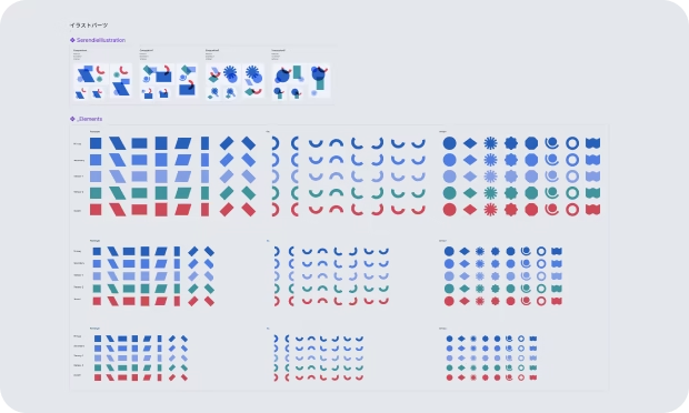
For the Serendie Design System operations team, we provide a lightweight illustration system in Figma. You can create illustrations for document hero images or placeholders inside components by switching variant properties.
Last updated 11/1/2024
Illustration system
For the Serendie Design System operations team, we provide an easy way to create Serendie-style illustrations when making new documents. Access it from the Illustration page in the Serendie UI Kit (Figma).
Currently, this is offered internally to the operations team. It is included in the Figma file but not published as a library (it is not available from the Assets panel inside Figma).

How to use
1. Copy a template
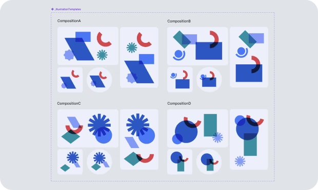
The “IllustrationTemplates Component” serves as the template. It has four composition types (layout patterns) and, for each, variations for hero/eyecatch and icon use cases. Each purpose also has landscape, portrait, square, and circular variants.
Copy the template that suits your goal.

2. Swap the parts in the copied template
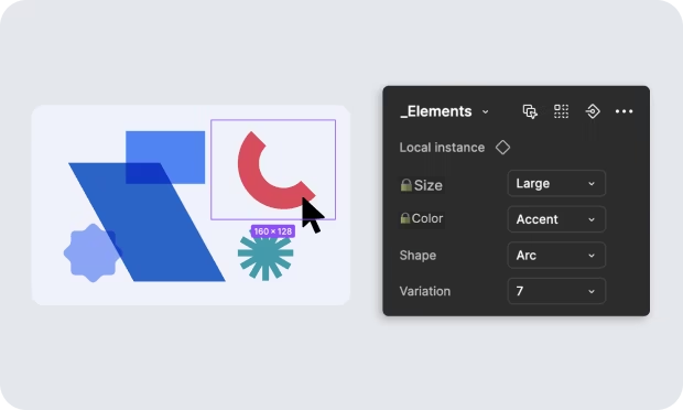
Templates contain componentized shape parts. Switch the variant properties on these shape components to create new illustrations. Each shape part has the following variant properties:
- 🔒️Size — three sizes: Small, Medium, Large
- 🔒️Color — five colors: Primary, Secondary, Tertiary1/2, Accent
- Shape — three types: Rectangle, Arc, Unique
- Variation — variations within each shape type
Do not change the properties marked with 🔒️ (Size and Color); change Shape and Variation instead. This keeps a consistent palette and layout while allowing illustration variety.

3. Confirm theme support
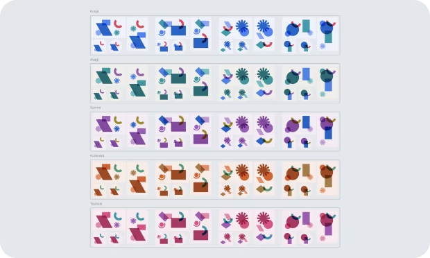
Colors in the illustrations are managed by Figma Variables. Similar to UI theming, setting the variable mode automatically applies colors for each theme. Set the variable mode and verify colors per theme.
