Color role
Color roles give meaning and function to colors chosen from the palette inside digital products. Color roles are defined as system tokens.
Last updated 10/30/2025
Role categories
Color roles are organized into three categories: Impression, Component, and Interaction. The category is part of the system token key.
The color roles we currently provide are the minimum set needed to compose Serendie UI. When you add original UI components, consider adding new color roles as needed.
Serendie Design System’s color roles are a subset of the Material Design 3 design, lightly adjusted for simplicity. Terminology such as role names follows Material Design 3. Refer to the Material Design 3 documentation for deeper understanding.
References
Color – Material Design 3
Impression
Brand colors and UI colors
Impression covers the roles related to the “impression” users receive when they see the product. This category includes roles for brand colors and for UI colors.
There are three brand color roles by priority: Primary, Secondary, and Tertiary. Primary shapes the product and brand impression and signals UI importance. Secondary and Tertiary are supportive and may not appear in every product.
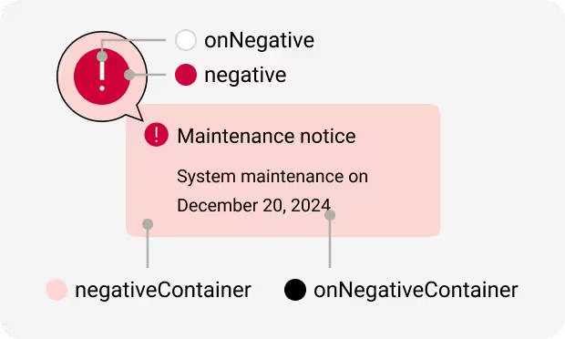
UI color roles communicate the function of the UI and the result of interactions—such as “success,” “failure,” or “warning.” From the perspective of the impression they give users, we group them into Positive, Negative, and Notice. While there are six subcategories within Impression, Primary and Positive often point to the same color, and you do not need to assign a different color to each.
Even when they ultimately point to the same color, separating the roles makes design tokens more resilient to change.
Foreground and background colors
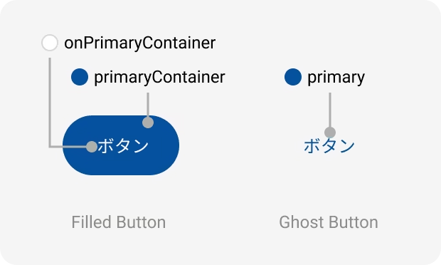
Impression tokens are used across many UI components, starting with Buttons. A key concept is separating tokens by foreground/background and by color area. For example, the design tokens fulfilling the Primary role are these four (partial token names shown):
- primary — text color and small-area backgrounds
- onPrimary — foreground color that sits on primary
- primaryContainer — large-area background color
- onPrimaryContainer — foreground color that sits on primaryContainer

Foreground colors use the prefix “on,” and large-area background colors use the suffix “Container.” All six Impression color roles follow this rule.
When designing accessible UIs, ensuring contrast between foreground and background is critical, and to adapt to context changes such as dark mode, you need separate tokens for foreground and background. Even for the same role, you often adjust lightness depending on color area. Negative, which is conventionally red, is a typical example. For these reasons, it is important to distinguish between tokens with “on” and “Container.”

Component
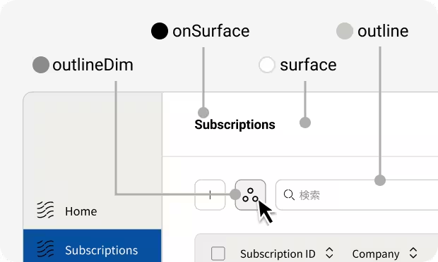
Roles in Component shape the UI itself. Representative roles are Surface and Outline. Surface refers to default backgrounds and text colors—often using neutral colors. Key tokens for the Surface role are (partial names):
- surface — the base color, such as the site background or card backgrounds
- onSurface — the default text color on surface
- onSurfaceVariant — secondary text color on surface
Outline represents UI border colors and provides variations with different visual emphasis.
- outline — default border color
- outlineBright — brighter border color
- outlineDim — darker border color

Interaction
Roles in Interaction represent UI component state changes. There are three roles: Hovered, Selected, and Disabled.
Selected, which indicates a chosen state, and Disabled, which indicates inactivity, often use fixed colors (e.g., gray for Disabled), and Serendie Design System follows that pattern.
Hovered, on the other hand, cannot be defined as a single color because the hover color changes depending on the pre-hover color. In Serendie Design System, Hovered tokens point to semi-transparent colors (Transparency). Use these as state layers and overlay them on the component being hovered to express the hovered state.
References
States – Material Design 3
Color themes
Serendie Design System provides presets of the color roles introduced on this page as color themes. For details, see Theming.